Global Website Redesign

Overview
This case study covers my role as the User Experience Lead in the creation and delivery of a fully redesigned global website for Cooper Tire.
--
Cooper Tire is an American company that specializes in the design, manufacture, marketing, and sales of replacement automobile and truck tires.
The Team
3
UX Designers
2
Visual Designers
8
Developers
2
Key Stakeholders
Project Approach
The Cooper Tire project was broken into three phases: Discovery, Design, and Implementation. For this case study, we'll just focus on the design and implementation phases.
PHASE 2: DESIGN
The Team
Executing on our strategic vision for a newly redesigned website would require a well-chosen Creative team. The Visual Design Lead and I worked together to hire our team of three Visual Designers and two UX Designers. This team would work with us over the next three months to create stunning data-driven, accessible designs.
My responsibility was to ensure that our team not only worked collaboratively with each other but also our product and client teams. Working together as a new team was a learning process and a really good experience for me as a lead. Here are a few things that I learned:
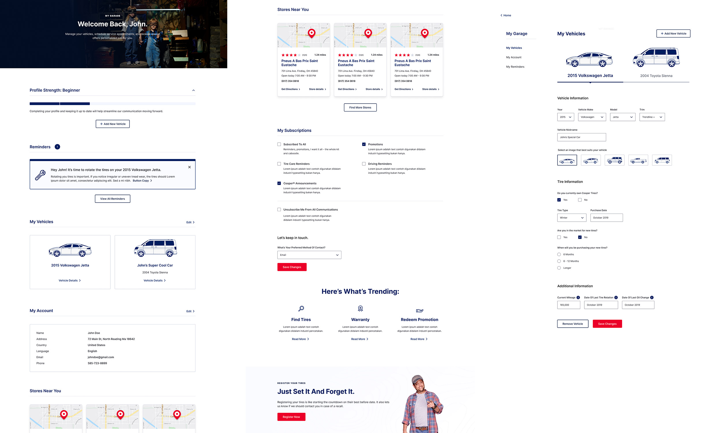
Testing Our Assumptions Early
Throughout the Design phase, it was important for me to find ways for my designers to test their assumptions. The first opportunity was during Sprint 0, where I asked our two UX designers to help me brainstorm initial concept ideas for a "Help Me Choose" tool, a requirement that came out of our client workshop in Phase 1.
Due to our client's budget, we were unable to secure an early round of user testing with our researchers. But I didn't want this to stop us from learning. Instead, I proposed we do our own round of testing. I asked one team member to focus on creating Wireframes and an Interactive Prototype and another team member to write-up a lightweight User Testing Plan. While that was taking place, I recruited 5 participants (friends, family, coworkers) who had recently purchased tires or were planning to purchase in the near future. Each member of the UX team was given the chance to moderate one of the sessions. Below is a clip from the testing sessions.
While kicking off Sprint 1 in Detroit (behind the scenes of an Uncle Cooper video shoot), I presented the results of this testing to the client. It was great to share these early insights with our client as a way of showing them that we were customer-centric, data-driven, and willing to go above and beyond for them. This was a defining moment in the project where I felt we had earned our client's trust and respect.
In addition to our lightweight testing and securing a later round of formal user testing, I was able to get buy-in from our clients to leverage Optimizely, a platform that provides A/B testing and multivariate testing tools, to test new design ideas on their current site.
Sprinting
The Visual Design lead and I worked together on our sprint structure and cadence. We opted for 3-week sprints with UX starting one-week ahead of design. We followed a typical cadence; meeting with our team every morning to discuss current tasks and blockers, reviewing our work with the client at key touchpoints, planning the next scope of work, and reflecting on what we did well and where we can improve.
Personalization Opportunities
During the design phase, we received a requirement from the business to create a profile for the customer as a means to learning more about the customer and collecting critical data on them. This data would be used to offer the customer a better experience, presenting the customer with more relevant content at the right moments.

While I was directing and overseeing the user experience work on some of the key pages for the website, the Visual Design lead and I worked closely on creating the account experience, which we titled "My Garage".
Help Me Choose Tool
One of the key features of the websites that we developed was a Wizard. The goal of this tool was to aid in helping novice tire shoppers find the right tire for them.

When this idea was first discussed in the Discovery phase, I knew I wanted to make it happen. But it wasn't my individual effort that brought this to life. Creating this tool was a collaborative effort between the business, product, UX, design, dev, and content.
PHASE 3: IMPLEMENTATION
Accessibility
Accessibility is very important to me. Throughout the design phase, we made every effort to ensure that our designs were accessible. This involved doing research to understand accessibility requirements, baking accessibility into our design, and collaborating with the development team. Below is an example of how I included accessibility annotations into our documentation.
Collaborating With Developers
None of these designs would have seen the public eye without the dedication of the development team we worked with. During the implementation phase, I met with our developers every morning to go over designs, answer questions, and work though edge cases. Our development team was offshore with almost a 12-hr time difference which initially was difficult to manage, but after some learning, I started to build a relationship with the team and made myself as accessible as possible.
Final Thoughts
At the time of this project, I was a Junior Experience Designer. I was asked to lead this project, hire a team, and deliver. I'm fortunate that I was given the opportunity to see what I'm capable of and also what I need to learn more of. It was very cool to see this website go live and know that I played a part in that. I'm also grateful we were given time to learn so much about our customer and assess the current pain points on the existing site in order to make better design decisions. Overall, I'm proud of the experience we created.